The Power of Infographics for Food System Conversations
By Jessica Meisinger, PhD – Merck Animal Health Veterinary & Consumer Affairs
It is a fact that less than 2% of the population in the United States is directly employed in agriculture1 and often stated that more education needs to occur to help the public understand how food is grown and raised. Consumers are regularly surveyed to determine what they are looking for when they go to the grocery store as well as to figure out their thoughts and feelings about meat, sustainability, animal welfare, and a host of other topics like what they want to see on a food label. It can be common for the results of these surveys to not match up with what people ACTUALLY buy. When responding to a survey, we are all guilty of sometimes sharing answers we think are the “right” answers or show our aspirational self, rather than what we typically do in real life. It can be a frustrating conundrum for researchers and can affect all aspects of society – including the agriculture and food system.
This behavior is especially true for new technologies being used to produce and process our foods. Some consumers will say that they don’t want GMO products but when asked to clarify, they don’t know what a GMO is or why they feel it’s a problem. Clearly there is a communication and information gap. One tactic often used to engage with consumers is infographics. Infographics are popular and eye-catching, but do they work? Do people actually read them? Do they make a difference in somebody’s opinion? Is there a way to objectively figure out how people think rather than directly asking them?
Merck Animal Health recently funded research at two universities to get to the bottom of how consumers felt about some hot topics in agriculture by collecting biometric data through functional magnetic resonance imaging (fMRI) scans and eye tracking. We used a series of infographics that reviewed six topics in agriculture: hormones, GMOs, sustainability, antibiotics, animal welfare and vaccines. Through this research, we wanted to discover which (if any) of the infographics were associated with overall better attitudes or greater attitude change particularly around topics that caused consumer skepticism.
Dr. Tyler Davis and others at Texas Tech University used fMRI to measure and map brain activity while participants looked at the infographics. The fMRI measures blood oxygen levels as the brain is working and can measure what area of the brain is working and what information it is processing in almost real time. This can give objective insight into consumer attitudes and decision-making behavior. The goal of this research was to determine if the infographics could elicit a change in attitudes and perceptions of risk of the technologies and topics covered. Short answer: yes, they did. The researchers found a stronger improvement in attitudes with the infographics that dealt with specific technologies that had the highest perceived risk – antibiotics, vaccines, hormones as opposed to those that covered broad topics like sustainability and animal welfare.
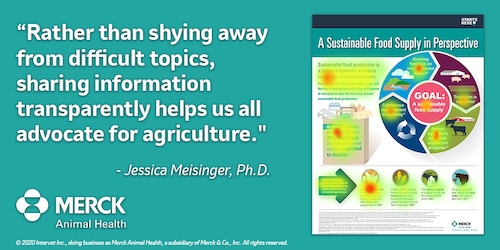
Dr. Rhonda Miller and others at Texas A&M University used facial recognition and eye tracking to quantify consumer response to the same series of Merck Animal Health infographics with the same goal of determining whether the infographics changed consumer perception as well to gain insight about how to further communicate scientific concepts to consumers in a positive manner. Eye tracking can be used to determine what captures the consumer’s attention and for how long and can also reveal the brain’s underlying processing decisions. Heat maps pointed to information that held the consumer’s focus. The researchers determined that, overall, the infographics were beneficial and increased a positive view of the topics. Further, the research indicated that the emotional response impacted the consumers’ overall liking, agreeableness and scan pattern, and greater objective knowledge influenced how consumers felt about an infographic. Perhaps not surprisingly, the research found that participants liked the infographics that focused on the farmer and found them more influential than those that focused on government agencies. This also gives us some direction on what to include when developing infographics on topics in agriculture in the future. But all in all, consumers read the infographic and their attitudes shifted at least a little bit about the topics.
So why does this matter? Consumers have to buy food products “untasted”—like sight unseen—and have to use other attributes to predict what steak or pork chop they might like the best, for example. Some factors like color or marbling are easy to understand. Other factors are more abstract, such as product differentiators that can affect how a person thinks and feels about a product before they actually eat or drink it. Brand is an example—there are many studies that show that people rate their liking of Coke or Pepsi differently if they do a blind taste test as compared to knowing which item is which. Consumers can assign value to factors such as beef raised under certain animal welfare standards (like GAP) or without antibiotics.
How can the agriculture and food system use this information? The research showed that infographics work! Sharing information about how food is grown and raised helps to remove concern and doubt and may inform purchasing decisions when standing in the grocery aisle. It also showed that consumers read the infographics and changed their opinions (at least a little) after learning the information. In fact, the more concern created by the topic initially, the greater the attitude change after reading the information. Rather than shying away from difficult topics, sharing information transparently helps us all advocate for agriculture. While it may be uncomfortable, food system leaders should embrace some of the more controversial topics which have the highest potential for a change of attitude. It can be stressful to have these conversations which can be emotionally charged, but these are the topics that consumers are hungry for more information about. If the agriculture and food system doesn’t share our story and information about how and why we do what we do…others will. And, that can lead to misinformation and leaves consumers confused or defaulting to the information they can find.
Another takeaway from the research is that infographics that focus on specific technologies had a greater impact – changed people’s opinions more than those that looked at broader topics. Rather than trying to cover a lot of ground, try to share information in smaller pieces that focus on specific technologies or issues, or for complicated topics, create a series of more easily consumed pieces
Follow-up is also important. Providing people with attractively packaged information makes a difference, but follow-up is vital to keep the conversation going through an open dialogue. Engage more regularly and provide more information. Consumers need to have a trusted and knowledgeable source to answer their questions.
As always with research, there are always more questions. How can the agriculture industry be more proactive? How can we follow-up? What works best? How can we combat ingrained resistance to new ideas? What else can we measure?
So, to follow my own advice, how can I follow-up with you? What questions do you have about these research studies? I welcome the opportunity for a phone conversation, e-mail, or LinkedIn message to see how our team can support our agriculture and food system partners
1. Economic Research Service. United States Department of Agriculture. Data Products. Ag and Food Statistics: Charting the Essentials. Ag and Food Sectors and the Economy. April 16, 2019. https://www.ers.usda.gov/data-products/ag-and-food-statistics-charting-the-essentials/ag-and-food-sectors-and-the-economy/. Accessed May 21,2020.